

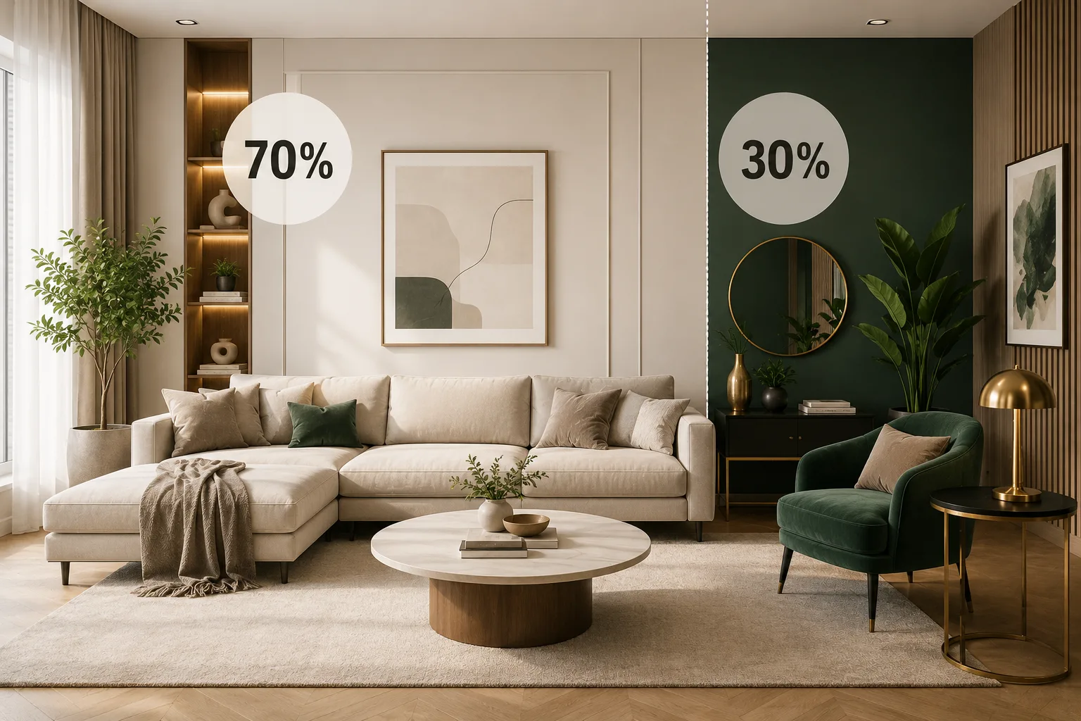
The 70/30 rule in interior design is a color and space-balancing principle where 70% of a room uses a dominant color or style, and the remaining 30% introduces a secondary color, texture, or contrasting element. This ratio creates visual harmony without making a space feel flat, cluttered, or overdesigned.
It's one of the most widely used foundational rules among professional designers, including any experienced home interior designer in Patna or elsewhere, because it works across styles — from minimalist to maximalist.
What Exactly Is the 70/30 Rule?
The 70/30 rule divides a room's visual weight into two proportions:
- 70% – Dominant Element: Walls, large furniture, flooring, and major textiles usually carry the primary color or theme.
- 30% – Accent Element: Cushions, artwork, rugs, curtains, or a feature wall introduce a contrasting or complementary color/texture.
This isn't a rigid measurement taken with a tape measure — it's a visual ratio designers use to judge whether a room feels balanced. A space that's 100% one color feels sterile; a space that's 50/50 often feels visually competitive, with no clear focal point.
Why Does the 70/30 Rule Work? (The Psychology Behind It)
Human perception naturally favors asymmetry over perfect symmetry — it feels more dynamic and intentional. The 70/30 split mimics patterns found in nature and classical art, where dominant and secondary elements coexist without competing for attention. This is closely related to the 60-30-10 color rule, a slightly more detailed version used in decorating:
RuleSplitBest For70/30 Rule70% dominant, 30% accentSimplifying color/style decisions quickly60-30-10 Rule60% dominant, 30% secondary, 10% accentDetailed color palette planningRule of ThreeOdd-numbered groupingsStyling shelves, tabletops, decor arrangementsBoth rules aim for the same outcome: a room that feels curated, not chaotic.
How Do You Apply the 70/30 Rule Step-by-Step?
- Choose your dominant color/style (70%). This usually comes from walls, flooring, sofas, and large furniture pieces.
- Select your accent color/texture (30%). Pick something that contrasts or complements — a bold cushion color, a patterned rug, or a wood-and-metal light fixture against neutral walls.
- Distribute the accent intentionally. Repeat the accent 2–3 times across the room (e.g., in curtains, a throw, and a vase) so it feels planned, not random.
- Step back and evaluate. If the room feels busy, reduce the accent. If it feels flat, increase contrast slightly.
- Apply it to furniture layout too. The rule isn't limited to color — 70% of your furniture can follow one material or finish, while 30% introduces a different texture (like glass, rattan, or brass).
Where Can the 70/30 Rule Be Applied Besides Color?
- Furniture styles: 70% traditional pieces, 30% contemporary accents (or vice versa) for a transitional look.
- Textures: 70% smooth surfaces (walls, upholstery), 30% textured elements (jute rugs, woven baskets).
- Lighting: 70% ambient/general lighting, 30% accent or task lighting to create depth. The U.S. Department of Energy notes that layering different lighting types improves both function and mood in a room, which pairs naturally with this ratio (energy.gov).
- Open floor plans: 70% of the space dedicated to a primary function (living), 30% to a secondary zone (reading nook, home office corner).
What's the Difference Between the 70/30 Rule and the 60-30-10 Rule?
People often ask this because both are color-related design rules. The 60-30-10 rule breaks a palette into three tiers (dominant, secondary, accent), giving more granular control. The 70/30 rule simplifies this into just two categories, making it faster to apply for beginners or smaller rooms. Many professional designers use 70/30 during initial planning and refine further with 60-30-10 once furniture and decor are finalized.
Common Mistakes to Avoid When Using the 70/30 Rule
- Overusing the accent color until it competes with the dominant tone.
- Ignoring texture and only thinking in terms of paint color.
- Applying the rule too literally — it's a guideline for visual balance, not an exact percentage to calculate.
- Forgetting natural light. Colors shift under different lighting, so always test swatches at different times of day.
Does the 70/30 Rule Work for Small Spaces or Rented Homes?
Yes. In fact, it's especially useful in small apartments because it prevents over-decorating. Keep walls and large furniture neutral (the 70%), then use removable elements like cushions, curtains, and wall art for the 30% accent — ideal for renters who can't repaint or install permanent fixtures.
How Does a Professional Interior Designer Use This Rule?
An experienced interior designer in Patna or any city typically starts client consultations by identifying the dominant palette based on the client's existing furniture, flooring, or architectural fixed points (like tile or woodwork), then builds the 30% accent layer around lifestyle preferences — favorite colors, artwork, or cultural elements. This is why hiring the best interior designer in Patna can save time: they apply proportion rules like 70/30 intuitively, adjusting them based on room size, natural light, and function, rather than following them mechanically.
Final Thoughts
The 70/30 rule remains one of the simplest, most reliable tools for creating balanced, visually pleasing interiors — whether you're decorating a single room yourself or working with a professional. If you're planning a full home makeover, consulting the best interior designer in Patna can help translate this principle into a personalized design plan suited to your space, lighting, and lifestyle.