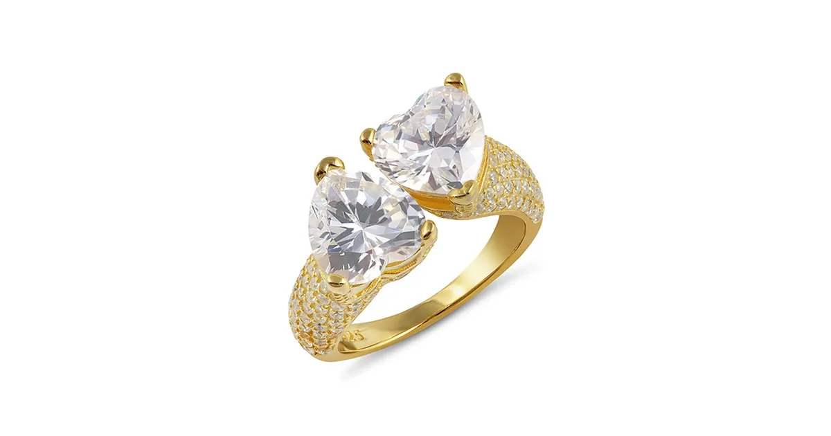
A shopper cannot pick up a ring, turn it in the light, or feel the weight of a necklace. The photograph has to do all of that work. For jewelry brands selling online, the photo is the product experience, and small editing mistakes cost real sales.
This is what makes jewelry one of the hardest products to photograph and edit well. A ring is small, reflective, and full of tiny details that a camera either flattens or exaggerates. A necklace catches light in ways that change with every small movement. A pair of earrings can look completely different on a white background than it does on a model. The job of retouching is to close the gap between what the camera captured and what the piece actually looks like, without crossing the line into fiction.
Why the photograph carries the whole sale
In a physical store, a customer holds the piece, feels its weight, watches it catch the light as they move it, and tries it on. Online, none of that is possible. The image is the only evidence the buyer has, and it has to answer every question a buyer would normally answer by handling the piece. Is the gold warm or pale? Is the stone bright or cloudy? Is the chain fine or chunky? Is the clasp solid? A single photo has to answer all of that at a glance, and a set of photos has to answer the rest.
Product images are the first thing shoppers look at and the last thing they check before buying. For jewelry, this effect is stronger than for almost any other product, because jewelry is bought for how it looks. Nobody buys a ring for its specifications. They buy it because it looks beautiful in the photo, and because they trust that it will look the same when it arrives.
That trust is the real product being sold. A jewelry photo that looks too perfect creates suspicion. A photo that looks careless creates doubt about the piece itself. The right edit sits in the middle: clean, bright, accurate, and honest.
Honesty is the whole job
The hardest part of jewelry photography is honesty. A diamond has to sparkle without looking painted on. Gold has to look warm without turning orange. A silver chain has to read as silver, not grey plastic. When retouching goes too far, the piece looks fake and shoppers lose trust. When it goes nowhere, dust, fingerprints and dull reflections make a fine piece look cheap.
Every piece of jewelry has a real appearance, and the buyer will compare the photo against it the moment the package opens. If the photo promised a brighter stone, a warmer metal, or a cleaner finish than the real piece delivers, the result is a return, a bad review, or a chargeback. Honest retouching protects the seller as much as it persuades the buyer.
This is why the best jewelry editors work with restraint. Their goal is not to make the piece look better than it is. Their goal is to make the photograph show the piece as it truly is, at its best, under good light. That distinction sounds small, but it is the difference between a store that keeps customers and a store that keeps processing returns.
Cleaning: the invisible first step
Before any creative editing begins, a jewelry photo needs cleaning. At the magnification of a product photo, every speck of dust, every fingerprint, every tiny scratch on the metal becomes visible. The camera does not forgive these details. A piece that looked perfect in the hand can look neglected in the photo.
Professional cleaning in retouching means removing dust and fibres, softening fine scratches on polished metal, and cleaning up smudges on stones and glass. It also means tidying the small things around the piece: stray threads, marks on the surface it rests on, and reflections of the photographer's equipment.
None of this work should be visible in the finished image. The viewer should simply see a clean piece of jewelry, not evidence that anything was removed. When cleaning is done well, the photo looks natural. When it is done badly, the metal looks plastic and the stones look flat, because the editor removed the texture along with the dust.
Metal tone: warm gold, true silver, honest rose gold
Metal is where most jewelry edits fail. Gold is especially difficult because its color shifts with the light, the background, and the camera's white balance. Yellow gold photographed under cool light looks pale and washed out. Under warm light it can turn orange. White gold can look grey or blue. Rose gold can drift toward pink or toward copper depending on the setup.
A skilled editor corrects the metal tone so that it matches the real alloy. This is not a matter of taste. A customer who orders a yellow gold ring and receives one that looks a different shade will feel misled, even if the difference is small. Consistent, accurate metal tone across a whole catalog is one of the strongest signals that a store is professional.
Silver brings its own problems. Polished silver reflects everything around it, including the camera, the lights, and the photographer's hands. Without careful work, a silver piece can look dark, dull, or covered in confusing reflections. The editor's job is to keep the bright, clean look of polished silver while controlling the reflections so the shape of the piece stays readable.
Platinum and other white metals are similar. They need to look bright and cool without turning blue or grey. The difference between a good silver edit and a bad one is often just a few careful adjustments to brightness and tone, applied locally to the metal rather than across the whole image.
Stones: light without lies
Stones are the second place where jewelry edits most often go wrong. A diamond, a sapphire, an emerald, or a pearl each behaves differently in front of a camera, and each needs a different approach.
Diamonds are the hardest. A camera tends to flatten them, turning a lively stone into a dull grey shape. The temptation is to paint brightness and sparkle back in, adding white highlights and star-shaped flares that the real stone never had. Shoppers have learned to spot this. A diamond that sparkles too perfectly in the photo reads as fake, and the store loses credibility.
The honest approach is to lift the brightness of the stone carefully, facet by facet, restoring the light the camera lost without inventing light that was never there. The stone should look bright and alive, but it should still look like a stone, with depth and variation, not like a drawing of a star.
Colored stones need a different kind of care. A sapphire that looked vivid blue on screen and arrives looking dark is a return waiting to happen. An emerald that looked rich green in the listing and arrives looking pale will disappoint. Careful color correction matches the image to the real stone, batch after batch, so the tenth listing looks like the first. This matters most for stores that sell the same stone in many pieces, where customers compare listings side by side.
Pearls are a third case. Their beauty is in their soft glow, not in sharp sparkle. Over-sharpening a pearl makes it look like plastic. Under-editing leaves it looking dull and grey. The right edit keeps the gentle shine and the subtle color variation that makes a real pearl recognizable.
Backgrounds and shadows
Backgrounds matter more than most sellers expect. A clean white background keeps the focus on the piece and meets marketplace rules, while a soft shadow underneath keeps it grounded instead of floating. Some brands prefer a lifestyle setting, a hand, a bust, a stone surface. Either way, the background should never compete with the jewelry. If a shopper notices the background first, the edit has failed.
White backgrounds are the standard for marketplaces such as Amazon, eBay and Etsy, and for good reason. They are neutral, they make the product easy to compare, and they keep the page looking clean. But a pure white background with no shadow at all can make a piece look pasted on. A soft, natural shadow underneath the piece restores a sense of weight and reality. The shadow should be subtle, consistent in direction, and matched to the light in the photo.
Lifestyle backgrounds need more judgment. A ring on a marble surface, a necklace on a linen cloth, or earrings on a model can all work beautifully, but only if the setting supports the piece instead of distracting from it. The background should be simple, the colors should be calm, and the piece should be the brightest and sharpest thing in the frame. Retouching a lifestyle shot often means softening the background slightly, cleaning up marks on the surface, and making sure the jewelry itself is the sharpest element.
Consistency matters here too. If one product sits on white, the next on marble, and the third on a model's hand, the store looks disorganized. A brand should choose one or two background styles and apply them across the catalog, so the shop feels like a single collection rather than a random set of photos.
Color accuracy and the cost of getting it wrong
Color accuracy is the part buyers complain about most, usually after delivery. It is also the part that costs sellers the most money, because color mistakes lead directly to returns. A customer who expected a vivid stone and received a dark one does not just return the item. They often leave a review saying the photos were misleading, and that review stays on the listing long after the return is processed.
Getting color right starts with the photograph itself: correct lighting, a calibrated monitor, and a consistent shooting setup. But retouching is where color is finished. The editor compares the image against the real piece, or against a known reference, and adjusts the hue and saturation until the photo matches reality.
This is skilled work because screens vary. A color that looks right on one monitor can look different on another. Professional editors work on calibrated screens and check their work against physical references, so the color they approve is the color most buyers will see.
For stores with many pieces in the same metal or stone, color consistency across the catalog is just as important as accuracy in a single photo. If the same gold looks different in ten listings, customers will wonder which one is real. A specialist service keeps a record of the correct tones for each material and applies them the same way every time.
Scale: showing the true size
Scale is another quiet problem. A pendant photographed close up can look like a statement piece when it is actually delicate. A ring shot with a macro lens can look far larger than it is. A bracelet photographed alone gives no clue whether it is slim or wide. When the piece arrives and it is much smaller or larger than the buyer imagined, disappointment follows, even if the piece itself is beautiful.
Showing the piece worn is the most honest way to communicate scale. A ring on a finger, a necklace at the neckline, earrings on an ear, or a bracelet on a wrist all give the buyer an immediate sense of size. Even a single worn shot among several studio shots can prevent most scale surprises.
When a worn shot is not possible, a familiar reference helps: the piece beside a coin, or on a hand, or with its measurements clearly shown in the listing. Retouching cannot fix a misleading photo, but it can keep the presentation truthful: correct proportions, no stretched shapes, no enlarged stones, and no cropping that hides the true size of the piece.
This is also a place where honesty and sales work together. A delicate piece photographed honestly will attract buyers who want delicate jewelry. A delicate piece photographed to look bold will attract the wrong buyers, and they will return it.
Consistency across a whole catalog
A single beautiful photo does not make a store. A catalog of hundreds of pieces, all photographed and edited to the same standard, does. Consistency is what makes a shop look professional, and it is what makes customers trust that the tenth item they buy will look as good as the first.
Consistency covers everything: the same background, the same shadow direction, the same crop, the same metal tones, the same brightness, and the same image size. When these are the same across the catalog, the store feels calm and reliable. When they vary, the store feels random, and customers start to wonder whether the products are as inconsistent as the photos.
For stores with large catalogs, this is where a specialist jewelry photo retouching service earns its keep. A single editor, or a small team working to a written standard, can apply the same treatment to every image, with fast turnaround, so new pieces can go live while they are still in demand. The standard should be written down: background type, shadow style, crop ratio, color references for each metal and stone, and the level of cleaning expected. With a written standard, quality stays the same even as volume grows.
A free trial on a few images is the sensible way to judge that quality before committing a whole catalog. Send the same piece in different lights, or several pieces in the same metal, and see whether the results are consistent. If they are, the service can be trusted with the full catalog.
Common mistakes that cost sales
Some editing mistakes appear again and again in jewelry listings, and each one costs sales in a different way.
The first is over-smoothing. When an editor removes every texture from the metal, the piece looks like plastic. Real metal has a fine texture, and the eye expects to see it. A good edit keeps that texture while removing only the dust and scratches.
The second is fake sparkle. Star-shaped flares, painted highlights, and artificial glints make a stone look like a cartoon. Shoppers recognize this instantly, and it makes the whole listing feel untrustworthy.
The third is wrong white balance. If the white background looks yellow or blue, every color in the image is suspect. The background should be neutral white, and the metal and stones should be judged against it.
The fourth is inconsistent backgrounds. A catalog where some pieces sit on white, some on grey, and some on patterned surfaces looks unplanned. Pick one style and keep it.
The fifth is over-sharpening. Sharpening can help a soft photo, but too much of it creates halos around edges and makes metal look harsh. The piece should look crisp, not crunchy.
The sixth is ignoring the small details. A clasp that is out of focus, a chain that is tangled, or a stone that is slightly off-center will all be noticed by buyers. Retouching can fix some of these, but the best results come from careful photography combined with careful editing.
How a professional retouching workflow runs
Understanding the workflow helps a seller judge a service and set realistic expectations. A professional jewelry retouching workflow usually runs in clear stages.
First, the images are reviewed and sorted. The editor checks each photo for focus, exposure, and composition, and flags any that need to be reshot rather than rescued. A photo that is badly out of focus cannot be fixed by editing, and an honest service will say so.
Second, the background is handled. The piece is cut out cleanly from its original background, the edges are refined so fine chains and prongs stay intact, and the piece is placed on the chosen background. This is delicate work for jewelry, because chains, prongs and fine settings have thin edges that are easy to damage with a rough cutout.
Third, cleaning takes place: dust, scratches, fingerprints and stray marks are removed, and the surfaces are tidied without losing texture.
Fourth, color and tone are corrected. The metal is matched to its real alloy, the stones are matched to their real color, and the overall brightness is balanced so the piece looks bright without losing detail.
Fifth, shadows and reflections are rebuilt. A soft shadow grounds the piece, and reflections are controlled so the shape stays readable.
Finally, the image is checked at full size, against the real piece or a reference, and exported in the sizes and formats the store needs. A good service checks its own work before delivery, because a mistake caught at this stage costs nothing, while a mistake caught by a customer costs a return.
Choosing a jewelry photo retouching service
Not every editing service is right for jewelry. It is a specialist job, and a seller should judge a service on jewelry specifically, not on general photo editing.
Start with a trial. Send a few images that cover the range of the catalog: a ring, a necklace, a pair of earrings, in different metals and stones. Look at whether the metal tones are accurate, whether the stones look real, whether the backgrounds are consistent, and whether the small details survived.
Ask about turnaround and volume. A jewelry brand can easily have hundreds of pieces, each needing the same careful treatment. The service should be able to handle that volume without dropping its standard, and it should be clear about how long each batch takes.
Ask about revision. Even the best service will occasionally miss a detail, and a clear revision policy protects both sides. One round of revision on each image is a reasonable expectation.
Ask about communication. A service that asks questions about the brand's standard, the metals used, and the background style is a service that cares about getting it right. A service that never asks anything is guessing.
And check the link between price and quality carefully. Jewelry editing is skilled work, and very low prices usually mean rushed work, automated tools, or editors without jewelry experience. The cost of a return, a bad review, or a lost customer is far higher than the cost of doing the edit properly the first time.
For a practical start, a dedicated jewelry photo retouching service with a free trial on a few images is the lowest-risk way to judge quality. If the trial images look like the real pieces, only better presented, the service is worth trusting with the catalog.
The test that matters
There are many ways to judge a jewelry photo, but one test matters more than the rest. Put the edited photo next to the real piece, under normal light. If they match, and the photo makes you want to pick the piece up, the retouching did its job. If the photo looks better than the piece, it will disappoint a buyer. If it looks worse, it will never get the chance.
Jewelry sells on trust, and trust is built one accurate photo at a time. The stores that win online are not the ones with the most dramatic images. They are the ones whose photos tell the truth beautifully, piece after piece, until customers stop worrying about what will arrive and start looking forward to it.